
Updater is a New York-based start-up that connects with key stakeholders in the moving process to provide a web application that allows users to carry out moving-related tasks in one place--like booking TV and internet, hiring a moving company, forwarding mail, and more.
Working with the marketing team alongside the Brand Designer, I :
• Redesigned and developed web pages for Updater's website in order to increase traffic to revenue-driving channels and maintain SEO rankings (live pages can be found here and here)
• Created fully customizable promotional landing pages used by the Marketing team to acquire new clients
• Supplied the Marketing and Product teams with motion graphics for promotional video and in-app use respectively
• Provided overall design support with website maintenance, presentation design, and marketing collateral
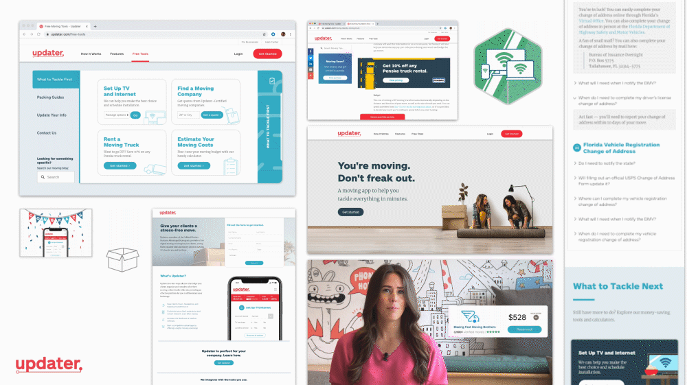
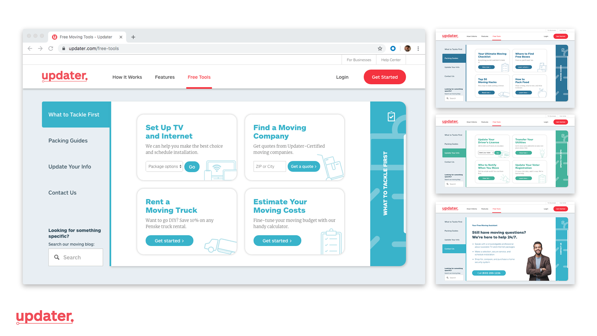
Free Tools Page Redesign
The marketing website for Updater as a whole was undergoing a full redesign, with the intent of becoming more consumer-facing and encouraging users to explore revenue-driving sections of the website to reserve TV and internet, hire a moving company, or rent a moving truck on their own. The Free Moving Tools page itself provides links to Updater's growing blog on moving tips and advice, as well as directs users to accomplish those aforementioned tasks.
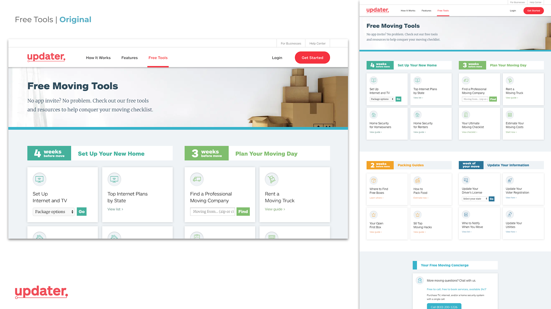
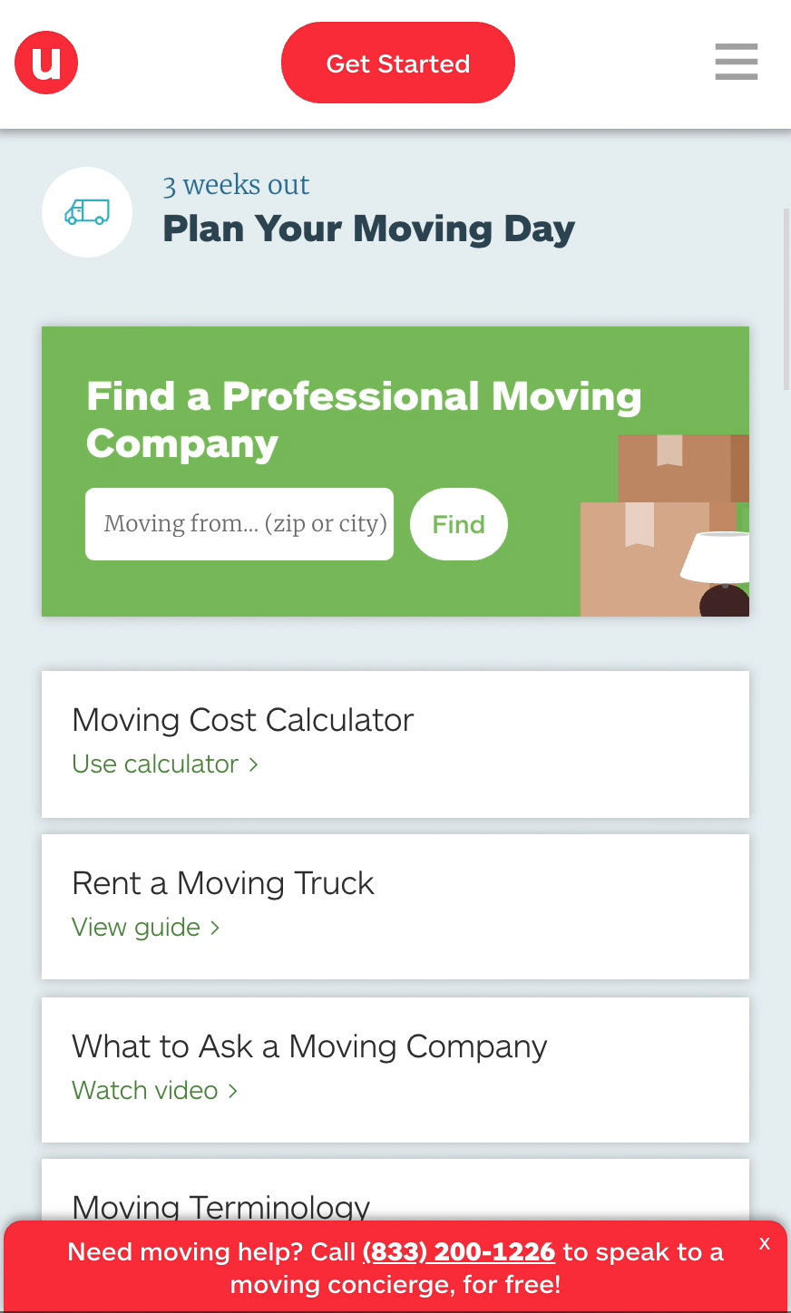
Initially, the page itself was somewhat timeline-based, with different tasks suggested depending on how many weeks were left until one's move date. In the first crack at redesigning it, I was curious if having a stronger timeline structure would help direct traffic. To do so, each revenue-driving section was turned into a primary "step," with supplemental links intended to provide additional information to accomplish that primary step. Upon actually testing it, however, we found that while we lowered our bounce rate by 4.67 percentage points, the click rates for our desired links didn't change much or decreased slightly. So, even though more people clicked on a link, because of the increased amount of options and lack of a clearer hierarchy, those clicks weren't on the pieces we wanted.
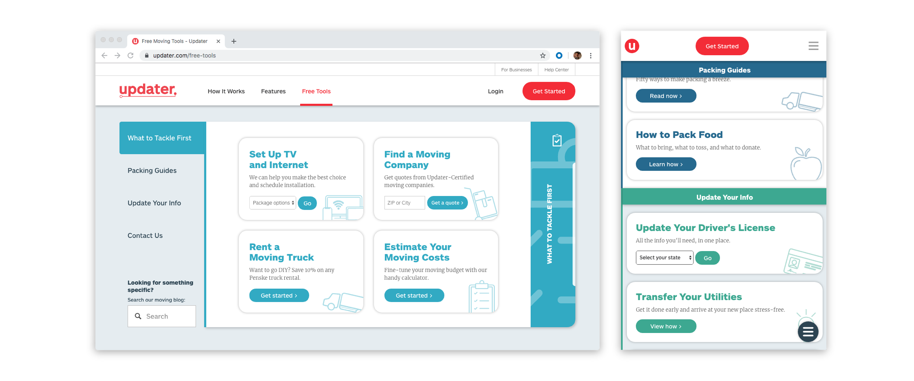
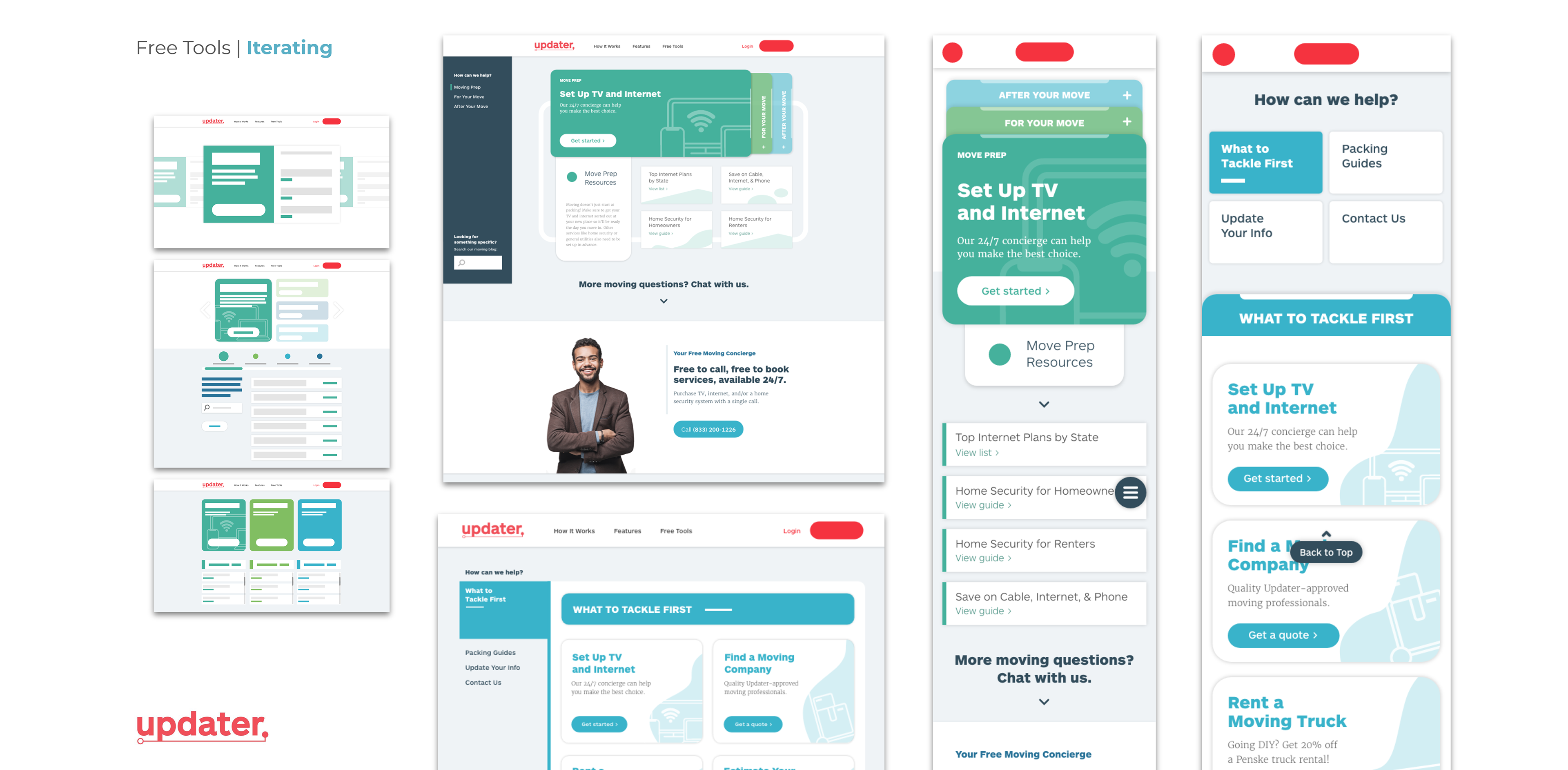
Moving forward, I wanted to think more about information hierarchy, and an overall mobile-first design approach. A large amount of users were viewing the page on their mobile devices, and to keep information organized, it requires a slightly different approach as opposed to working with a desktop layout. The timeline idea was also reworked into more general sections, but keeping the important and high-priority tasks front and center on page load.
With this, the intent was to make it feel more like a web application than just a series of links. It's a bit more visually and mechanically distinct from other sections of the page with the sidebar navigation, but it's that difference that gives the page a little more authority and makes the provided links feel more like web tools.

Initial Prototype
Initially, the page itself was somewhat timeline-based, with different tasks suggested depending on how many weeks were left until one's move date. In the first crack at redesigning it, I was curious if having a stronger timeline structure would help direct traffic. To do so, each revenue-driving section was turned into a primary "step," with supplemental links intended to provide additional information to accomplish that primary step. Creating this page also served as an entry point to learn to code collaboratively, and understanding the Git workflow.
Upon actually testing it, however, we found that while we lowered our bounce rate by 4.67 percentage points, the click rates for our desired links didn't change much or decreased slightly. So, even though more people clicked on a link, because of the increased amount of options and lack of a clearer hierarchy, those clicks weren't on the pieces we wanted.
Reframing and Iteration
Moving forward, I wanted to think more about information hierarchy, and an overall mobile-first design approach. A large amount of users were viewing the page on their mobile devices, and to keep information organized, it requires a slightly different approach as opposed to working with a desktop layout. The timeline idea was also reworked into more general sections, but keeping the important and high-priority tasks front and center on page load.
With this, the intent was to make it feel more like a web application than just a series of links. It's a bit more visually and mechanically distinct from other sections of the page with the sidebar navigation, but it's that difference that gives the page a little more authority and makes the provided links feel more like web tools.
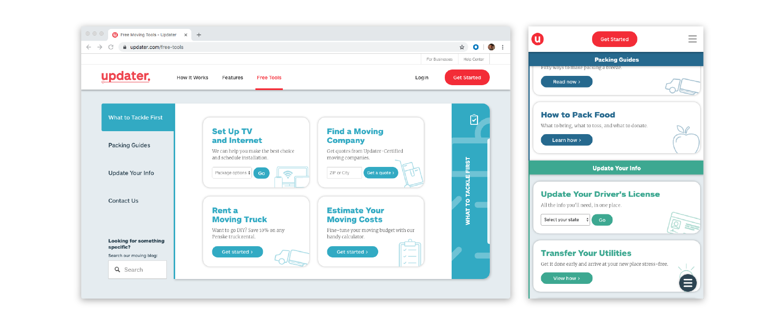
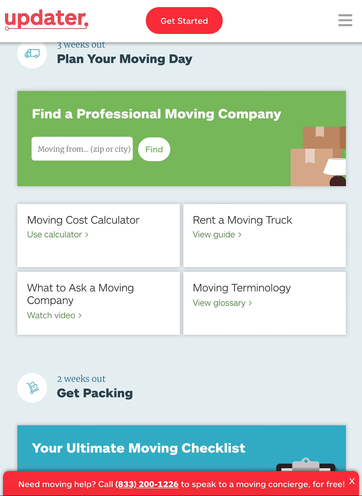
End Result and Testing
Ultimately, while the tab system is helpful in organizing the sections, the nature of mobile required a different expression of that hierarchy. Adding a sticky header while also providing an expanding menu to jump from section to section helps streamline the process, but also keeps our most important section as the first thing to be seen at the top.
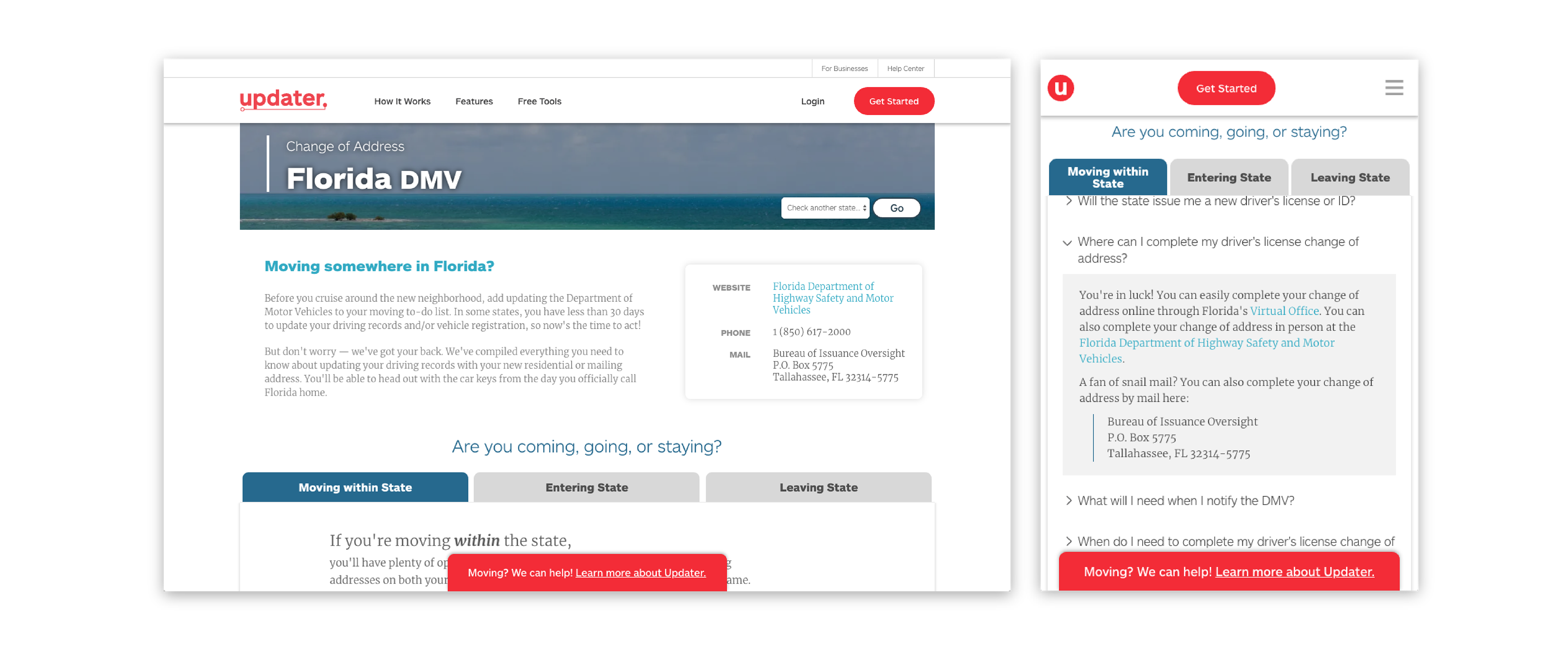
DMV Pages: Applying Insights
The approaches of mobile-first design, and reorganizing information with the visual language of a web application were incredibly helpful in redesigning the Free Tools page, and so I wanted to see if I could take what I had learned from that process elsewhere.
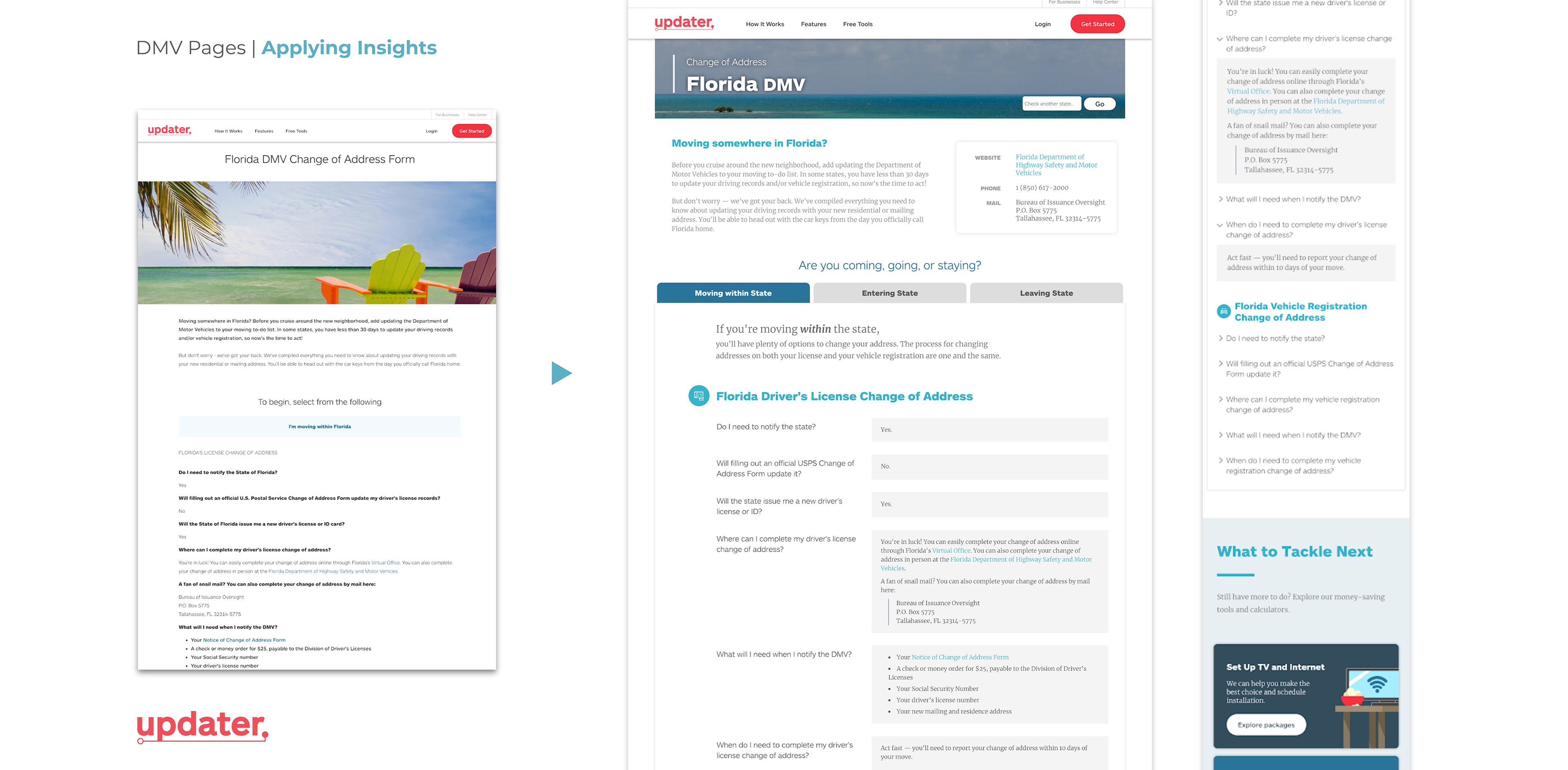
Information regarding updating one's vehicle registration and license information when moving was curated into a page for every state (plus District of Columbia) in the form of questions and answers. They're fairly high traffic pages, but because they don't lead anywhere else on the site, it's easy for someone to enter, get the information they need, and leave without realizing what Updater actually is.
As a possible solution, and simply to make it easier to find the information you're looking for, I reorganized the information into tabs with a stronger visual hierarchy, and provided links to revenue-generating areas similar to the Free Tools page. The idea behind this would be just to have the potential of leading someone to other places of the site, particularly with the idea that because this information is so helpful and organized, then the user would understand that Updater is equally (if not more) capable of helping them with the rest of their move.
The page itself is a template to make creating the fifty-one pages easier, and questions are collapsible on mobile to cut down on vertical scrolling.
Unfortunately, this launched toward the end of my internship, so it's still in the testing phase. However, the page for Alabama can be viewed here.
Reflections
I don't think I could speak highly enough of Updater and the people I worked with! This was my first time working in an office setting, and getting to work alongside the Marketing team as a whole was a great opportunity to ask questions about what everyone else was doing and see how they all fit together. It was also the first time that the audience of my work wasn't just who I was intending to show it to, but also whoever needed to work with it—making something usable and useful for the Marketing team required making documents more user-friendly and templatized, and so it really made me consider not just the end result of my work, but also how it functions once I'm no longer the one working on it.
As a whole, I think the key to my time at Updater was really learning how to learn. I had a lot of autonomy which was exciting, but I also had to learn the right things to ask and develop a process where I was constantly learning something new and implementing that knowledge somehow.
I'm incredibly grateful for my time at Updater, and know for certain that the skills I've learned there will be invaluable for whatever comes next!
(Gonna miss the office dogs, though.)